Windows 8 is a computer science masterpiece trapped inside a user
interface kerfuffle. Microsoft’s new operating system for phones,
tablets, laptops, desktops, and servers brims with innovative
technologies, bold ideas, and visual elegance.
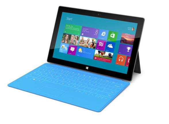
.The system’s radical new interface, called Modern, is a pleasure to use on phones and tablets. And although that interface fares poorly on today’s larger desktop computer screens, Windows 8 probably won’t damage the company’s standing in corporate America. It might even shore up its eroding presence on residential desktops and laptops by offering a user experience that’s new, fun, and different from anything offered by Apple and Google. Indeed, that’s my only real criticism of Windows 8: the touch-based user interface is clearly designed for consuming information and having fun, rather than for doing serious work.
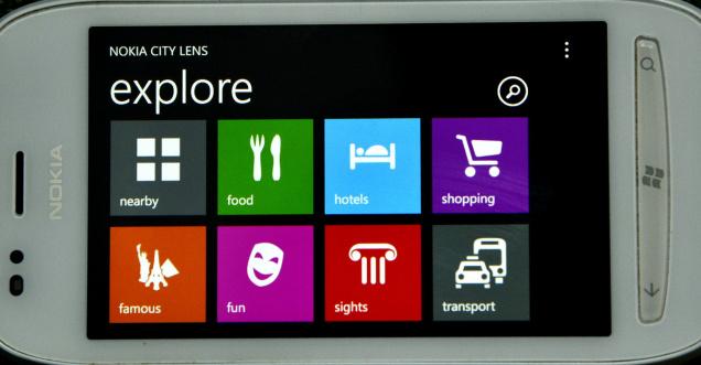
It makes technical sense for Microsoft to maintain a single, core operating system with a consistent set of application programming interfaces (APIs). In fact, it makes so much sense that Apple and Linux moved to a single kernel years ago. What’s different about Windows 8 is that it gives users a similar graphical user interface (GUI) on every platform, too. Microsoft has spent more than a decade trying to get cut-down versions of its operating system, with names like Windows CE, Pocket PC, and Windows Mobile, accepted on mobile platforms. Some of these systems even had scaled-down versions of the standard Windows desktop interface—complete with pop-up windows, buttons, scroll bars, and even tiny Start buttons. But their GUIs and APIs were just different enough to confuse programmers and users alike. Windows 8 finally delivers consistent GUIs and APIs across the Microsoft ecosystem, although it is now the desktop that wears the tablet’s clothes.
.The system’s radical new interface, called Modern, is a pleasure to use on phones and tablets. And although that interface fares poorly on today’s larger desktop computer screens, Windows 8 probably won’t damage the company’s standing in corporate America. It might even shore up its eroding presence on residential desktops and laptops by offering a user experience that’s new, fun, and different from anything offered by Apple and Google. Indeed, that’s my only real criticism of Windows 8: the touch-based user interface is clearly designed for consuming information and having fun, rather than for doing serious work.
It makes technical sense for Microsoft to maintain a single, core operating system with a consistent set of application programming interfaces (APIs). In fact, it makes so much sense that Apple and Linux moved to a single kernel years ago. What’s different about Windows 8 is that it gives users a similar graphical user interface (GUI) on every platform, too. Microsoft has spent more than a decade trying to get cut-down versions of its operating system, with names like Windows CE, Pocket PC, and Windows Mobile, accepted on mobile platforms. Some of these systems even had scaled-down versions of the standard Windows desktop interface—complete with pop-up windows, buttons, scroll bars, and even tiny Start buttons. But their GUIs and APIs were just different enough to confuse programmers and users alike. Windows 8 finally delivers consistent GUIs and APIs across the Microsoft ecosystem, although it is now the desktop that wears the tablet’s clothes.